
Brand Design- Rosey& Co.
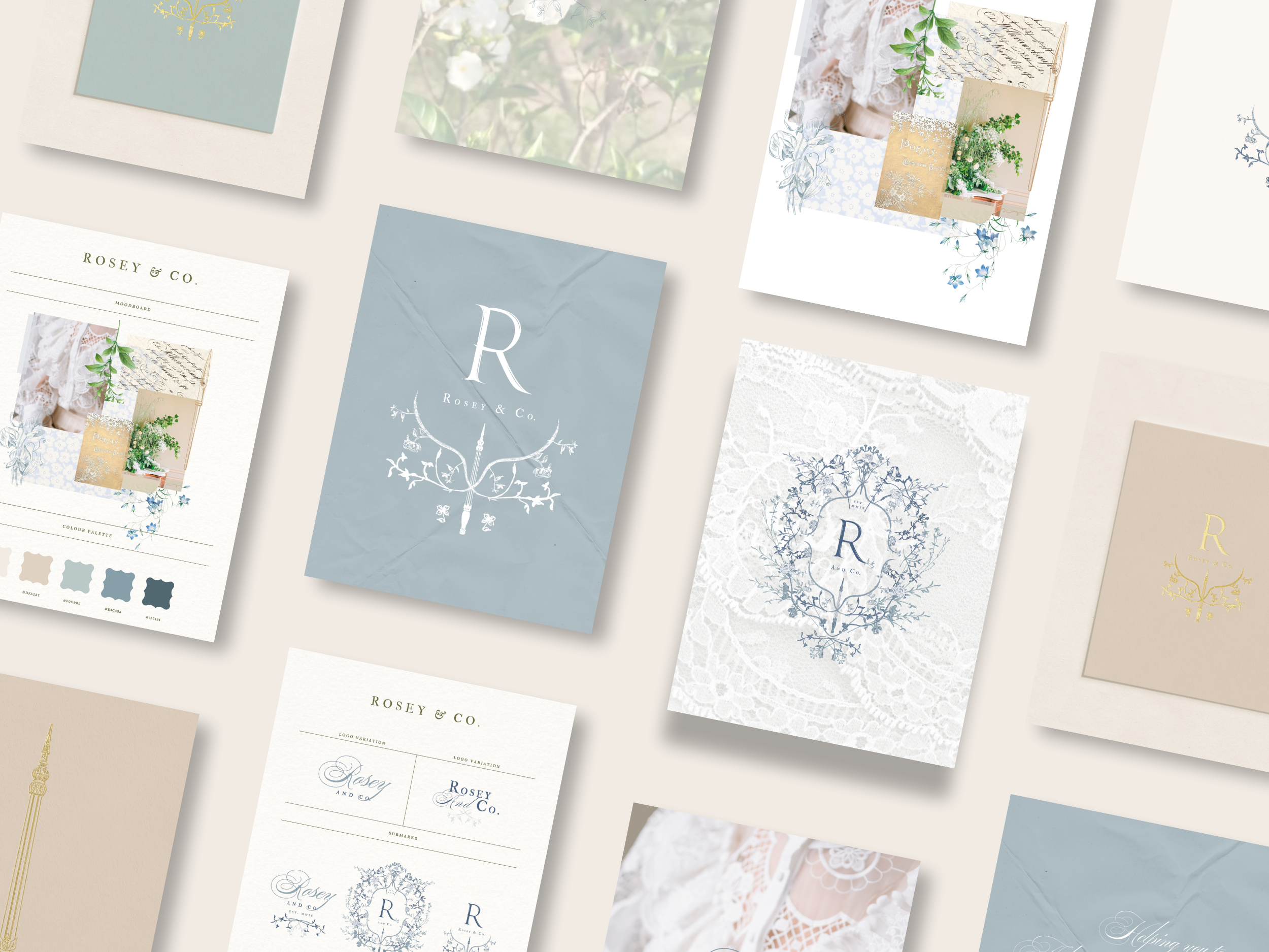
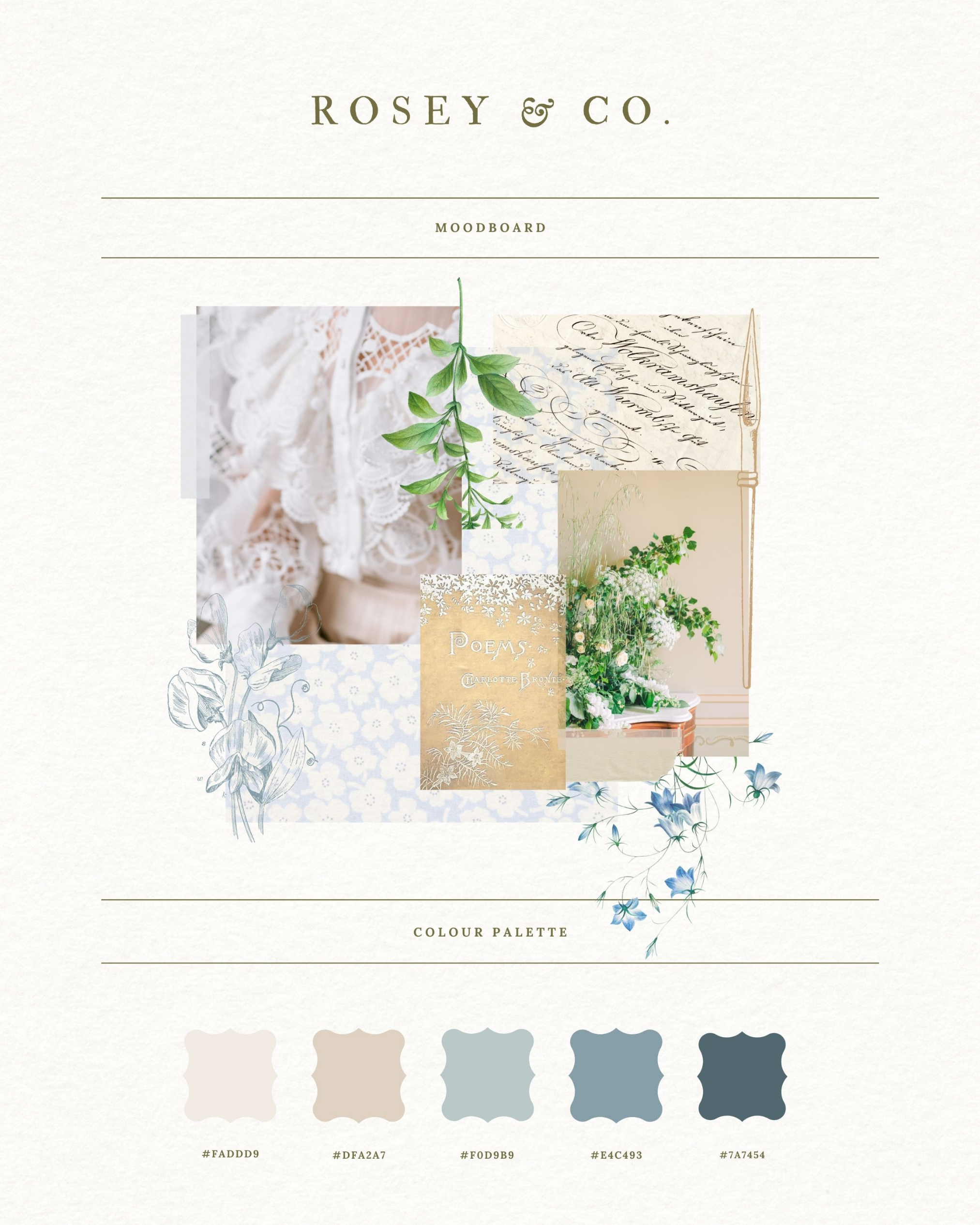
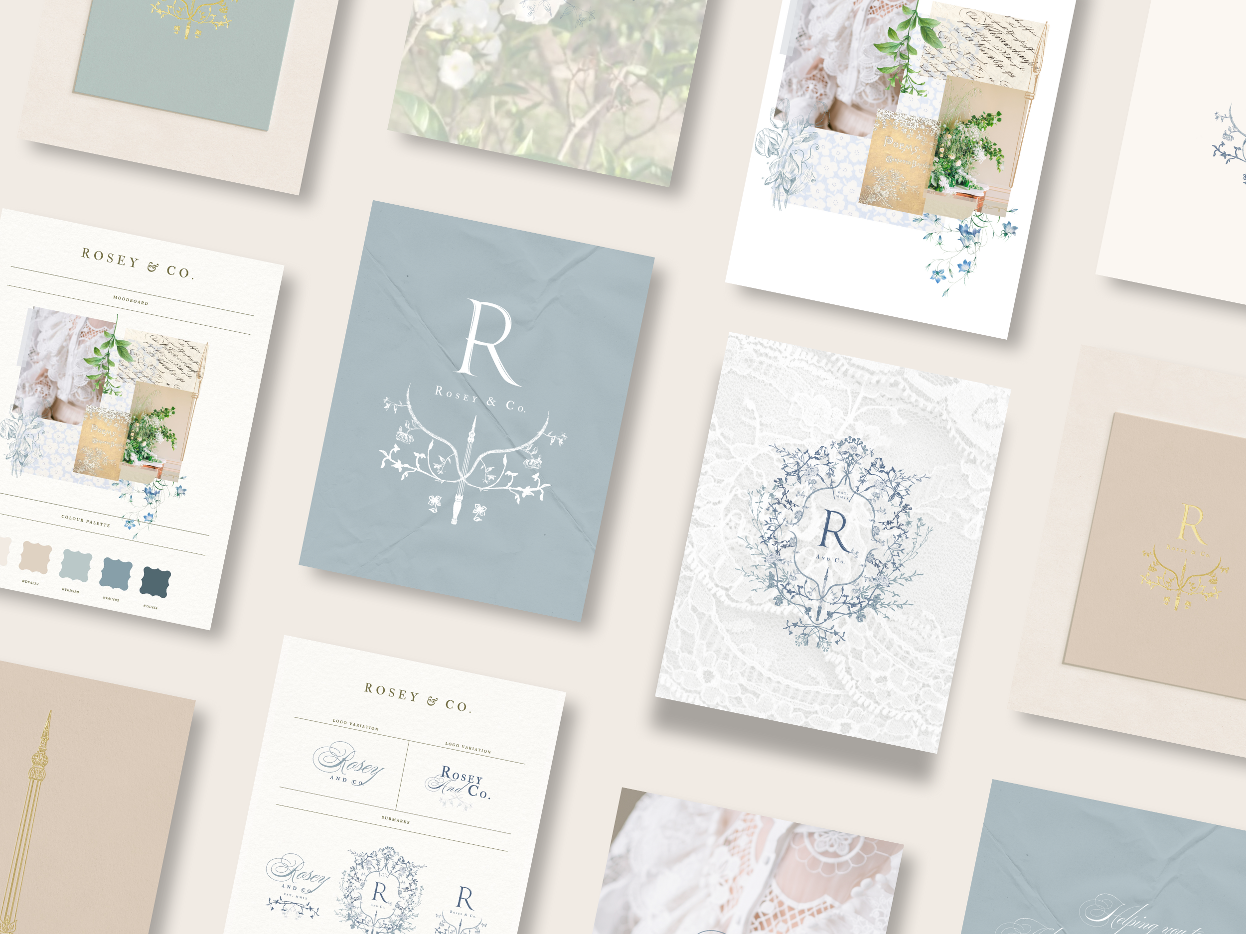
PROJECT DETAILSAfter deciding to move away from wedding stationery and into graphic design, I knew I needed to rebrand my business to reflect this change. To ensure stability in my business, which has been running since 2009, I chose to include blue in my new colour palette. This colour signifies the trust and dependability my clients have found in me.
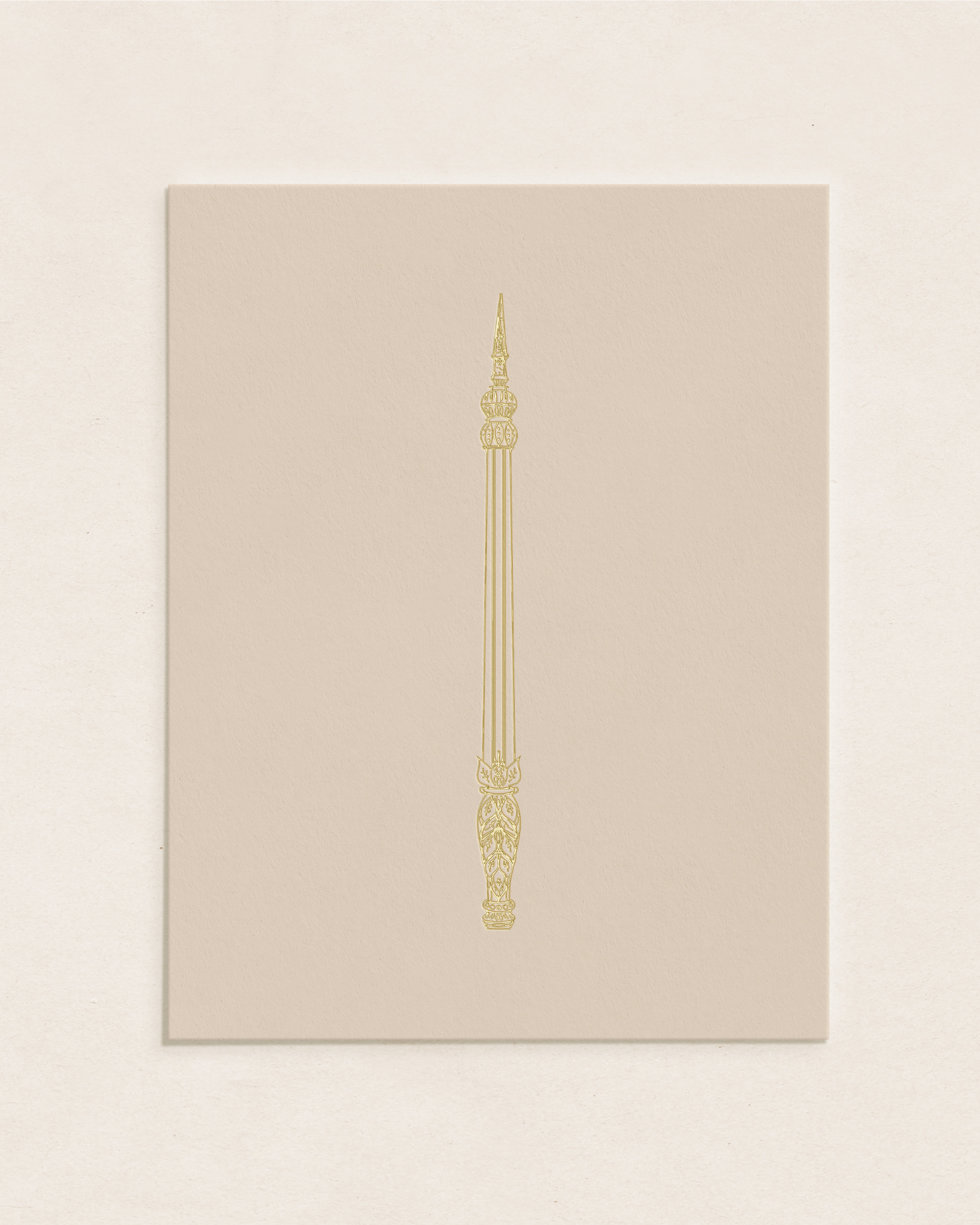
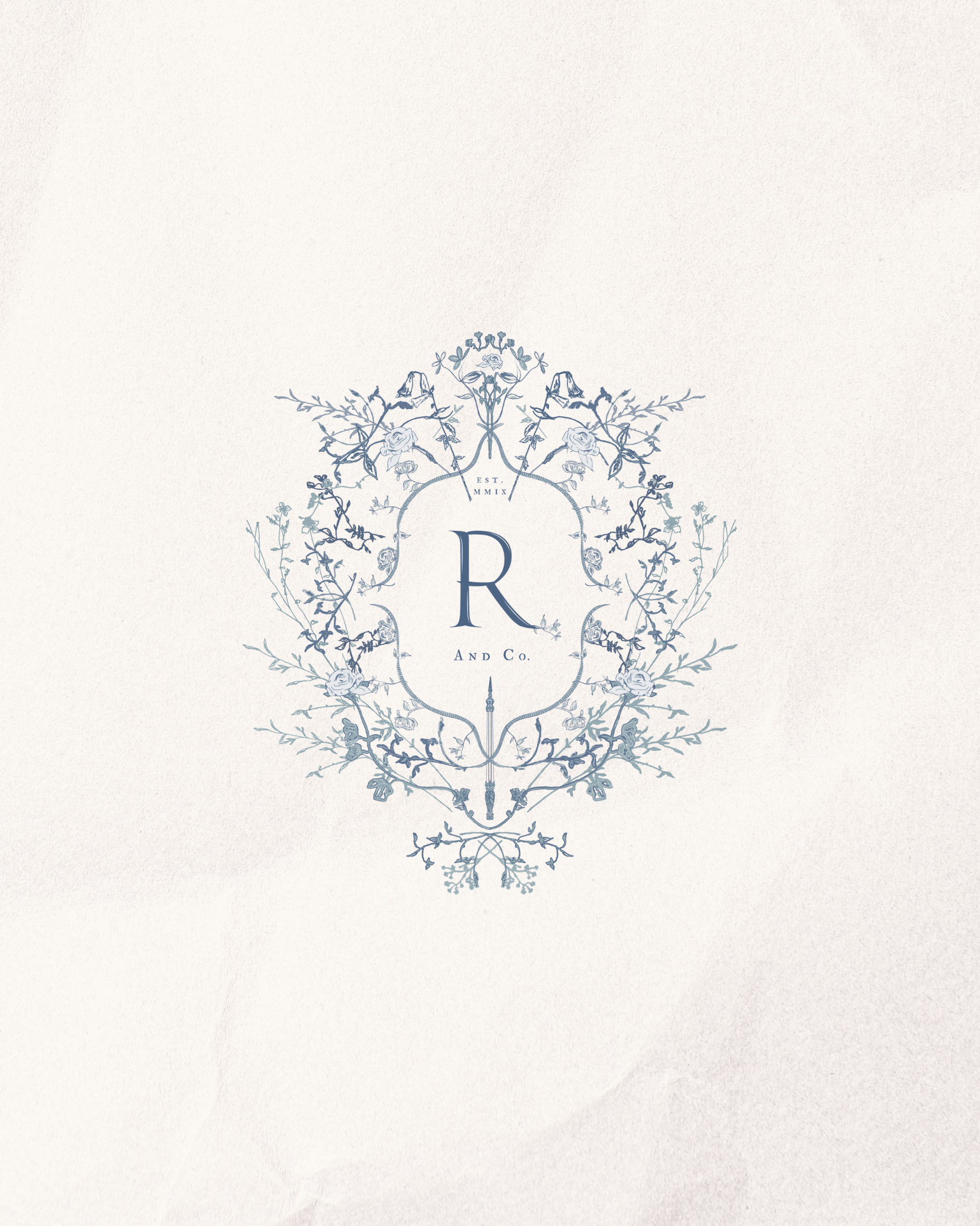
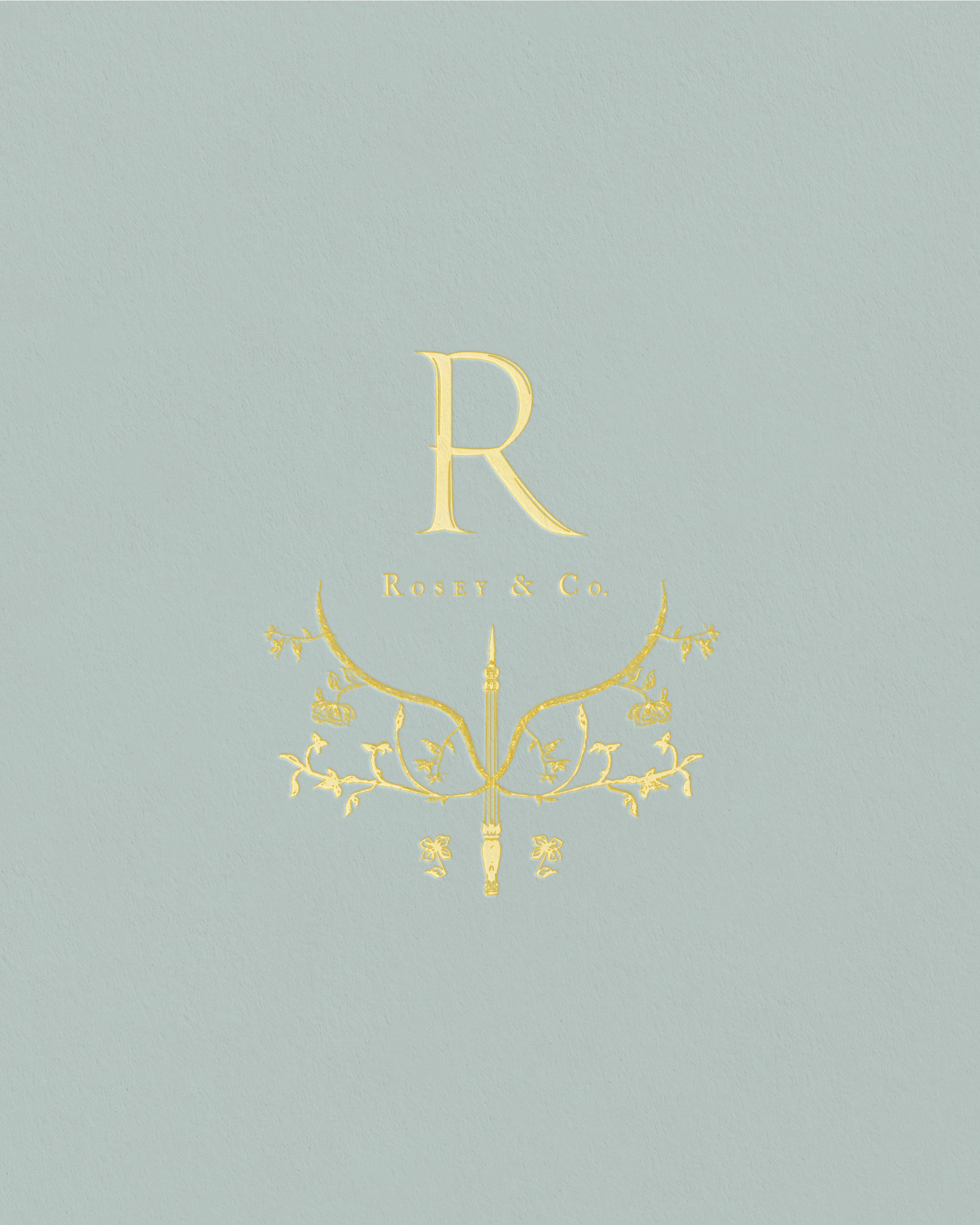
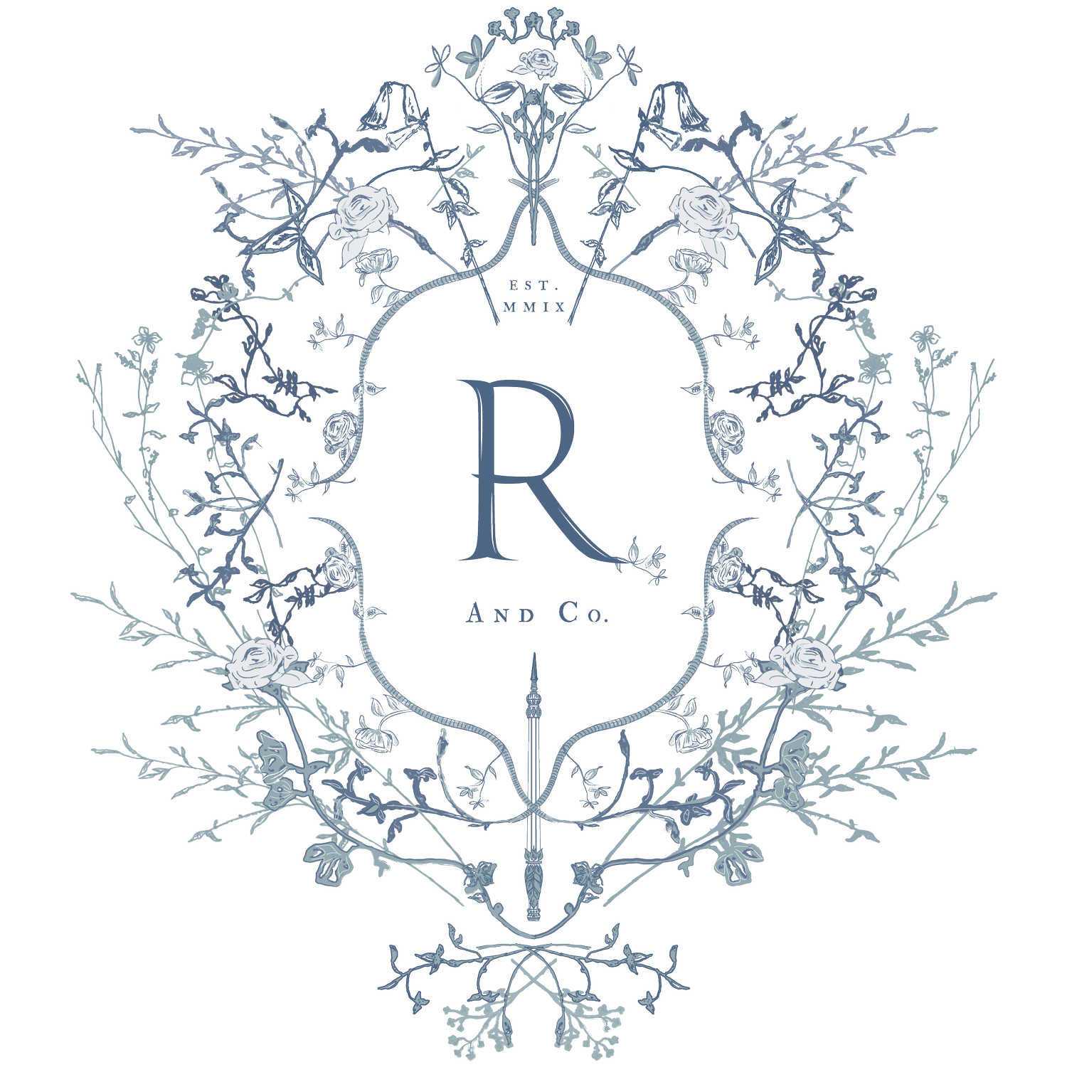
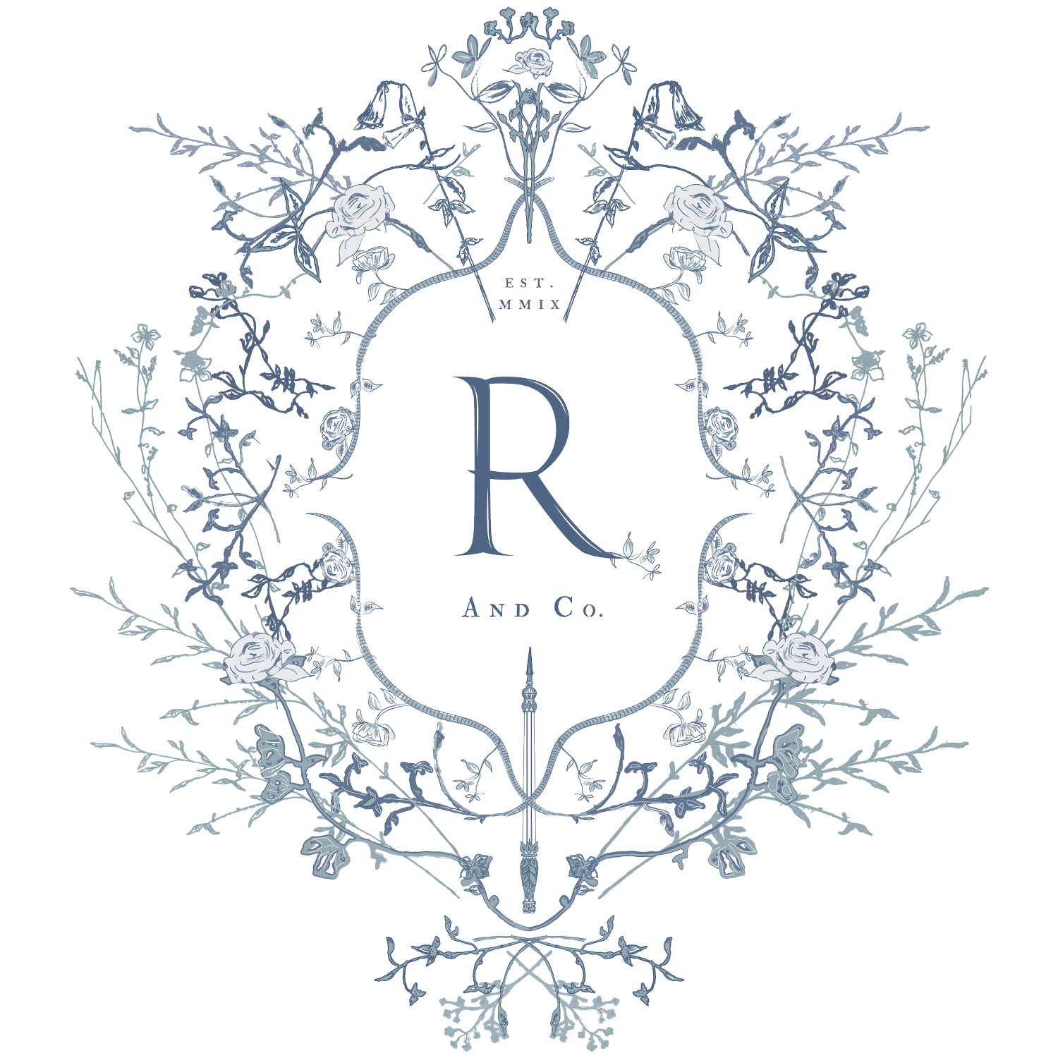
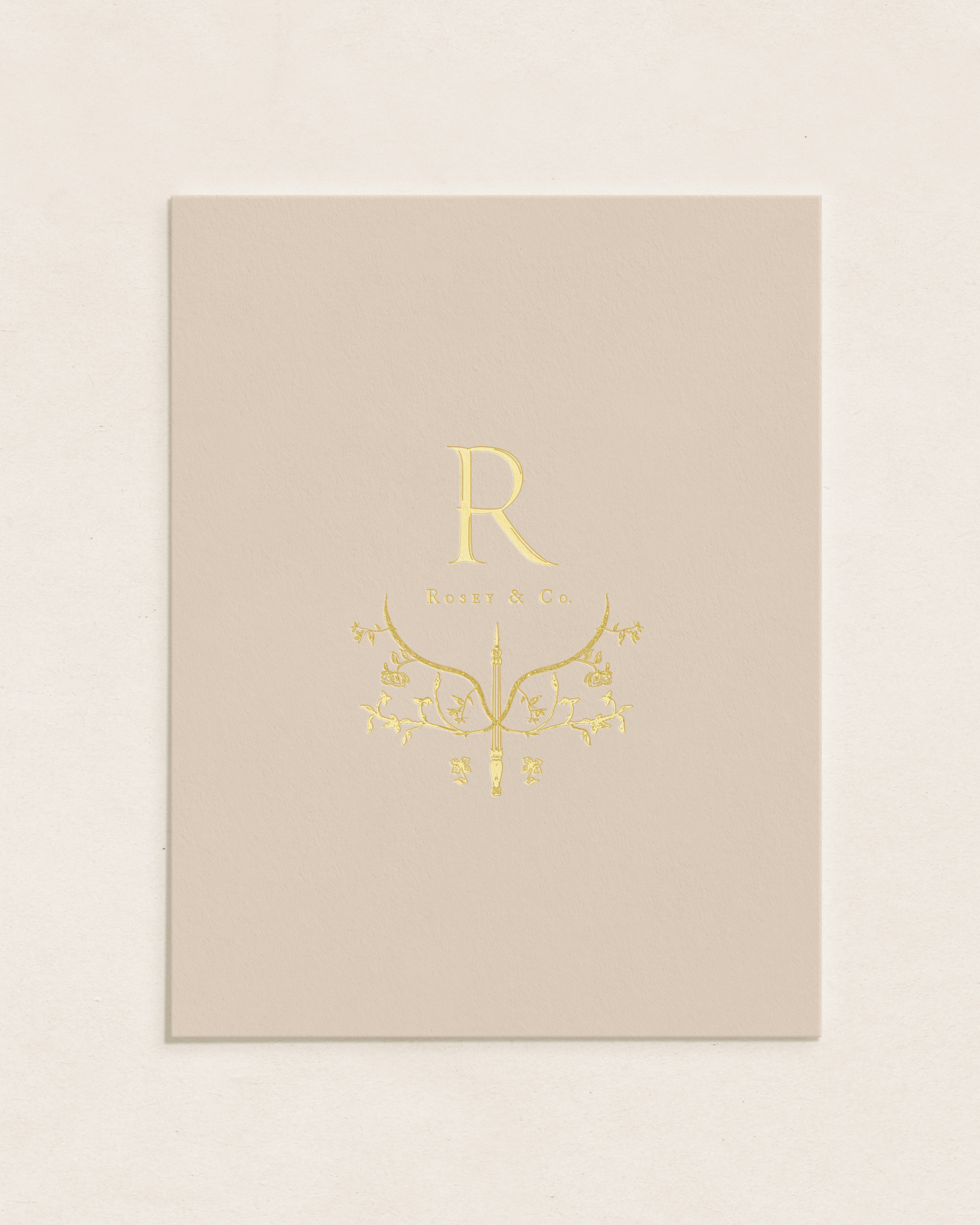
To create a mark that was both memorable and impactful, I designed a crest with intricate detail. This crest includes florals that hold special meaning to me, such as sweet peas and roses. At the base of my crest lies a Georgian pen illustration, which I also use as my personal emblem. This detail works as an anchor for the crest, showcasing the use of illustrations in my design work and the structured, reassuring approach I take when working with clients.
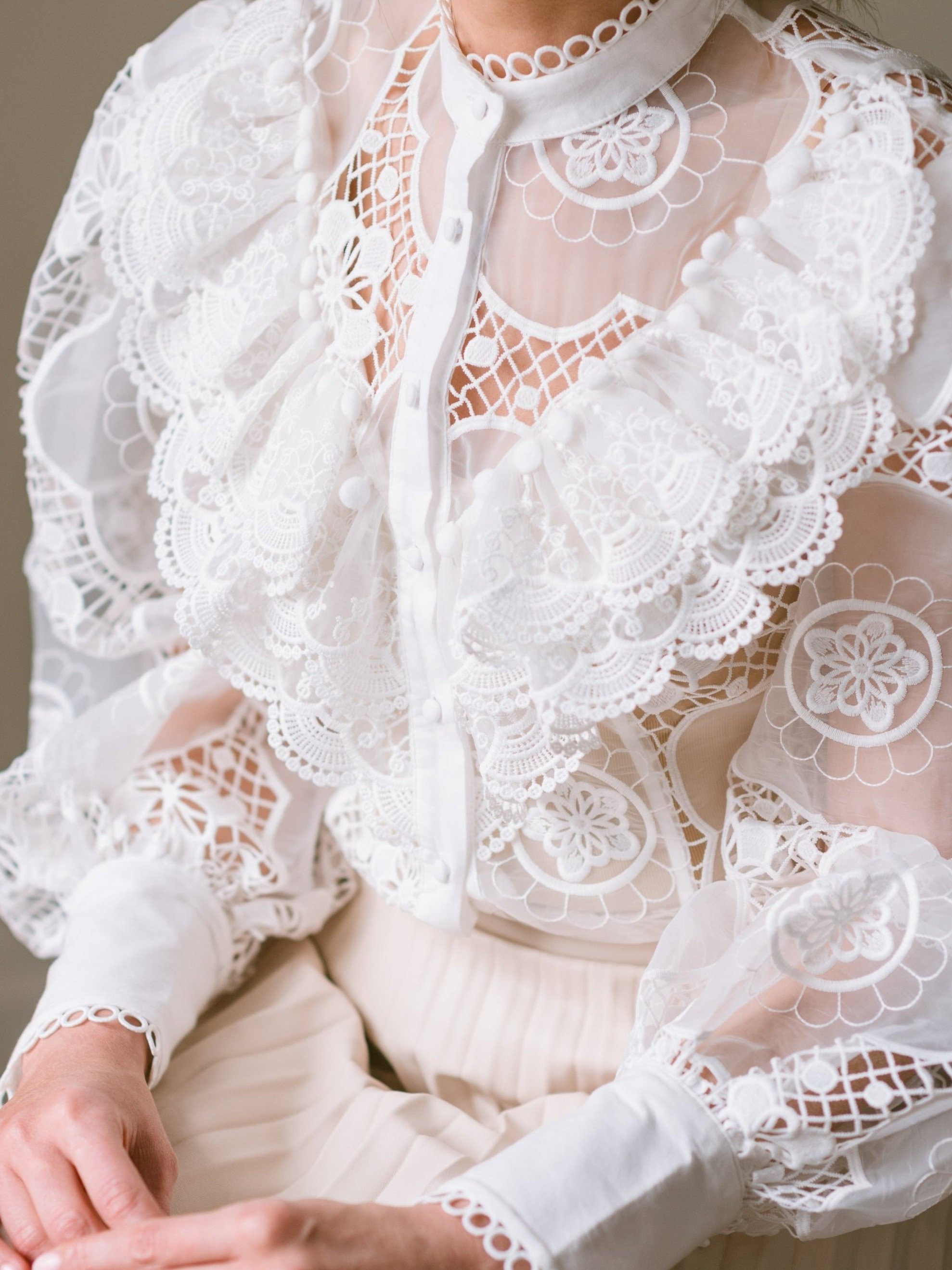
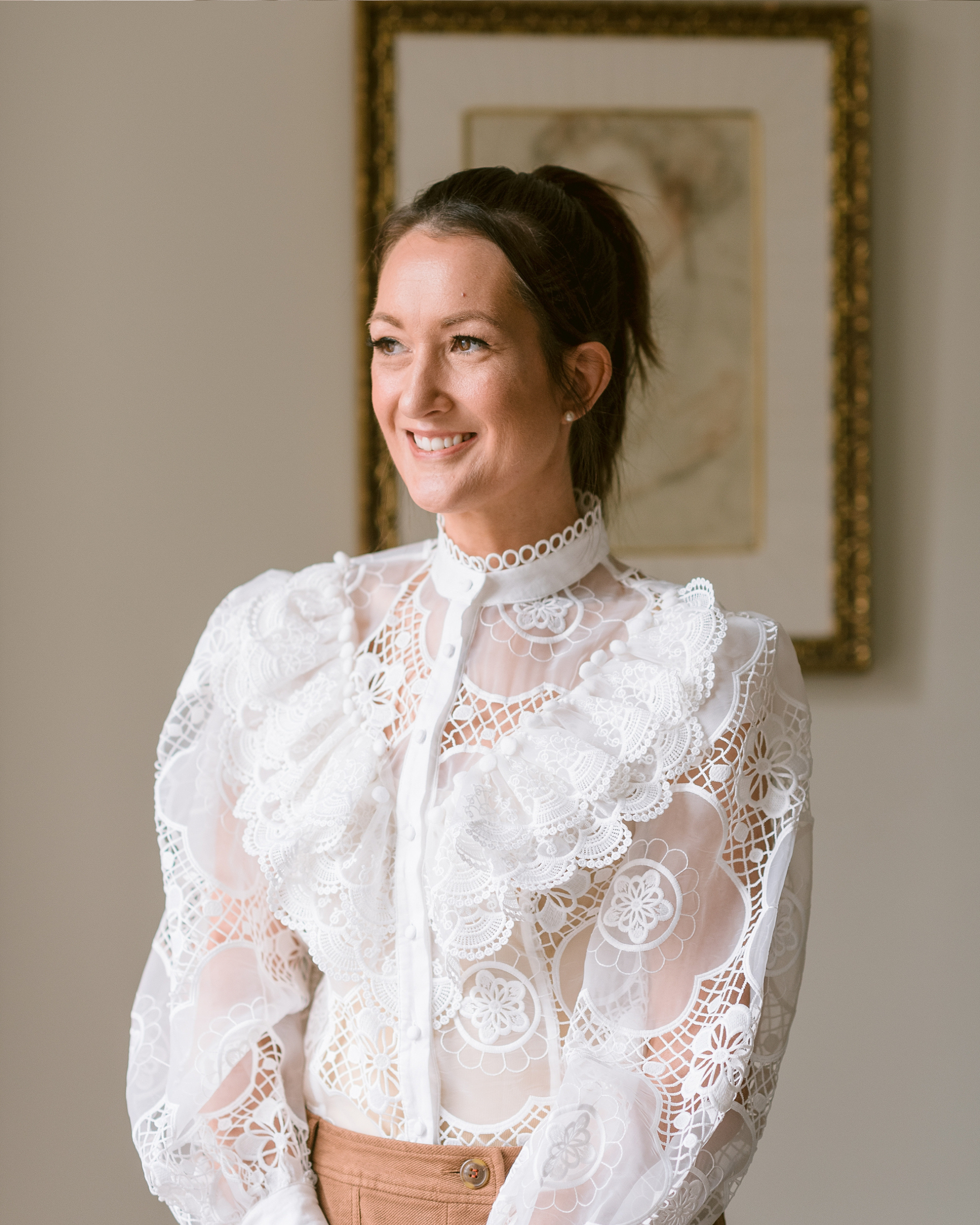
BRAND PHOTOGRAPHY BYEva Tarnok
DATE: APRIL - JUNE 2022